Inspiration
Nature’s palette: a celebration of spring
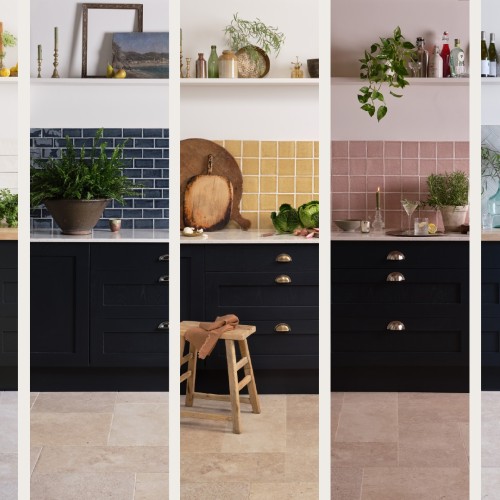
At this time of year, nature offers a palette of colours that is as varied as the weather. From warming sunny yellows and soft blossom pinks to crisp, invigorating greens and deep blue-greys the colour of inky skies.
Nature is a source of great inspiration for us at Marlborough Tiles, and with spring blooming around us, our attention is being drawn to the freshest combinations of the new season.
We couldn't resist translating some of our favourite pairings into tile and paint colours, to offer inspiration for your next project, so that you can enjoy the freshness of spring in your home year round.
Soft and Romantic
Inspired by the colour of a classic English rose, Neptune's Old Rose is a dusky pink that pairs beautifully with these patterned tiles from our Emma collection in Sage.
Neptune's paint in Old Rose with hand painted Emma patterned tiles in Sage create a look that is fresh and romantic.
Designed in collaboration with leading interior designer Emma Sims-Hilditch, the collection is reminiscent of floral wallpapers, with an intricate leaf pattern hand painted onto each tile by our talented team of artists. The tiles also feature our signature crackle glaze, stained by hand for a charming vintage look.
Whilst florals are a natural choice for spring, Emma offers a subtle nod to the changing of the seasons that will be loved the whole year round.
Vibrant and Uplifting
While one might typically associate springtime with soft and delicate shades, nature's palette at this time of year can be truly vibrant.
Quince paint by Neptune and Figgins Lane square brick tile from our Savernake collection offer a fresh and contemporary feel.
Uplifting Quince is Neptune’s colour of the season, and brings to mind the first brave sprigs of spring. This colour combines olive hues with undertones of warming yellow, making it perfect for pairing with bold and intense Figgins Lane from our Savernake collection.
Named after one of the historic streets of our factory's birthplace in Marlborough, Figgins Lane has has a beautifully grounding effect on more vibrant colours such as Quince, and the pair make for a combination that feels contemporary, energetic and bold.
Sunny and Inviting
Reminiscent of the snowdrops that signal the beginning of spring, Neptune’s paint in Snow is a fresh, creamy white.
This Neptune kitchen painted in Snow pairs beautifully with our joyous Halcyon square tile in Saffron with hand piped Margot pattern.
While white is often perceived as a cold colour, Snow's warm undertones makes it the ideal partner for this square tile in Saffron, from our Halcyon collection. This joyous shade makes us think of daffodils and the first rays of sunshine that are synonymous with this time of year.
Tiles from the Halcyon collection are available in a choice of four hand piped patterns on a handmade artisan biscuit. The pretty petal motif shown here is called Margot.
CALM AND GROUNDING
Another shade named after roses, Edward Bulmer’s Cuisse de Nymphe Emue is a dusty pink with a touch of umber. Here, we have chosen to pair it with a soft and comforting warm white; Winterbourne from our Kennet collection. The earthiness of this combination is both calming and grounding.
Winterborne tiles from our Kennet collection are shown here in a herringbone pattern, and would look simply fantastic in this country kitchen painted in Edward Bulmer's Cuisse de Nymphe Emue.
The Kennet collection is our considered take on the skinny metro tile, and in designing it, we paid close attention to the balance of the tile’s proportions. As a result, they are just a touch longer than other metro tiles, and narrower - striking a pleasing visual balance when installed, between grout line and tile.
Fresh and Playful
Edward Bulmer’s Verdrigris is a fresh and uplifting colour, described on their website as 'a beautiful Prussian blue based green with an underlying earthy tone but a wonderful radiance.'
Artist Daisy Sims-Hilditch's London kitchen painted in Edward Bulmer's Verdigris with Chalk White tiles from our Contemporary Classics collection.
Shown here in artist Daisy Sims-Hilditch’s London kitchen with our Contemporary Classic tiles in Chalk White, the overall effect is fresh and playful, and perfectly spring-like.
The undulating surface of the tiles reflect the light around the space, providing an arresting contrast with the vibrant colour of the kitchen cabinetry, and setting off Daisy's collection of copper pots beautifully.
__
Our full range of handmade wall tiles can be explored here, and if you need any assistance, please get in touch. Our design team would love to hear from you.
As featured in…


