Practical tips
A guide to our world of colour
Colour is one of our core strengths at Marlborough Tiles. In fact, our ability to create colour and glaze from scratch is one of the things that truly set us apart. Each one is individually mixed, expertly combined from our collection of over fifty raw pigments and stains to create the perfect nuance of shade. In short, you simply won't find our colours anywhere else. Within our collections you will find an extraordinary array of colours and tones – from the deepest greens to the softest grey-blues, and in today's article, we're sharing just a small selection of our most popular tiles in a spectrum of our richly coloured glazes to provide inspiration. Explore more shades here.
Deepest plum to palest pink...
If you're looking for a bold option that offers a luxurious feel, consider a rich plum or dark, wine red. These deep tones work particularly beautifully in smaller spaces and those with a lower light.
Pink is an increasingly popular colour when it comes to interior design, and while it might once have been considered a risky choice, used well, it is far from sugary sweet. In the right environment, pink is in fact a timeless and uplifting neutral. It will flatter or accentuate a variety of looks, from romantic, to vintage, to playful.
Read our article, Rethink pink, to discover some of our favourite ways to incorporate pink and blush into your kitchen design scheme using tile.
... sunshine yellow to golden brown...
Sunny and welcoming, yellows and taupes work beautifully in contemporary and traditional homes alike.
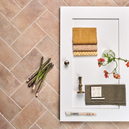
Their darker cousins, warm and earthy soft browns are a surprisingly versatile neutral. Try them alongside paler neutrals, earthy greens or even a soft, dusky pink paint for a look that is wonderfully nostalgic and grounding.
There's a secret to the stunning depth of colour seen across our deepest and most vivid greens and blues. To mix them, we draw upon traditional techniques first used by the Victorians, such as adding cobalt and copper oxides into the glaze. These oxides refract light of a different frequency to the pigment, adding dimension to the colour.
The bolder greens in our collection have an undeniable depth and grandeur, though you might prefer to add delicate tendrils of green through a pretty, hand painted pattern.
Often overlooked when it comes to decorating, green in fact has real versatility and will add a sense of balance and freshness to both modern and classic spaces. Learn more in our article, In the green room.
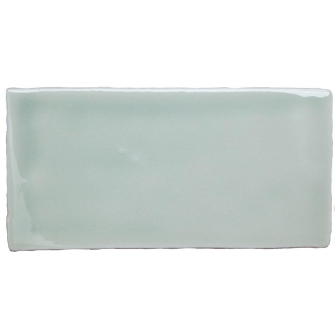
Blue greys are some of our most popular glaze colours, and we offer a spectrum from deep, inky blue greys to palest dove greys, and from coolest to warmer tones that include a dash of pink.
Read our article, The summer blues, where we dive in to a selection of our favourite tiles in cool blue tones, to bring a sense of tranquility to your kitchen or bathroom project.
... to neutrals and whites...
Bringing a sense of harmony to any space, neutrals and whites are a wonderfully versatile choice — beautiful in their own right or as a companion to almost any other shade.
When creating these glazes, our colour specialist Anita always begins with our hand mixed opaque white frit. Next, she adds the smallest amount of a stain chosen from our bank of over fifty pigments. “Subtle undertones can create a very different overall effect,” Anita explains. “A dash of blue makes for a cool, bright white, stunning in a contemporary bathroom. Adding a touch of pink to the white frit creates a softer look that works beautifully in a country kitchen.”
While our precise colour recipes are a closely guarded secret, we can tell you that one of our favourite whites has no less than four different pigments. Learn more in our article, The timeless appeal of white tiles.
Understanding the light in your space will help you to choose the perfect tile. South facing rooms are basked in light from the sun all day long, and cooler tones will bring a sense of balance to those spaces. On the other hand, north facing rooms will be warmed and softened by a glazes that include subtle yellow or pink tones.
It is worth noting that colours can look quite different depending on the light in which they are viewed. Not to mention, different screens will display colours slightly differently. For these reasons, we recommend that you order a selection of samples of your favourite tiles, placing them in your space for a few days and looking at them at different times of day, before making your final choice and placing a full order.
Alternatively, pop into our inspiring showroom, where you can fully appreciate the unique nuance of colour that make our tiles so special.
And of course, if you would like a little more guidance, please do not hesitate to get in touch with our Design Team. Our all-encompassing design service can help you define your vision, with a bespoke session dedicated to understanding your interior design needs.
As featured in…


