Inspiration
An ambitious, two-phase country kitchen renovation project
If like us, you’re guilty of whiling away the hours scrolling interior design inspiration on Instagram, you are likely to already be familiar with Vivienne Cutler’s beautifully curated account.
Vivienne is a self-confessed interiors-obsessed lover of monochrome, and her account documents the renovation of the beautiful four-bedroom Victorian cottage in the Sussex countryside, where she lives with her husband and their two teenage sons.
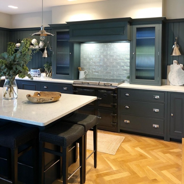
We were thrilled when Vivienne chose Morning Mist tiles from our Seasons collection to add the finishing touch to her gorgeous Neptune kitchen, and even more pleased when she agreed to share her kitchen story with us.
In today’s article, Vivienne answers our questions about their two-phase kitchen project and shares her tips for planning and managing large-scale home renovation projects.
Of course! The house was built in 1894 as a home for workers of the large country estate it belonged to. Originally it was a small two-up, two-down, but it was extended during the 1980’s by the previous owners.
We fell in love with its traditional charm and character, and its beautiful location on a quiet country lane. We could see that the house had lots of potential, and bought it in September 2016, with plans to renovate and modernise the entire property.
What an exciting project! What was the kitchen like when you bought the house?The kitchen was about thirty years old when we moved in! It was pine but had been painted bright yellow, with dark blue formica worktops and a very old oil-fired Aga. There wasn’t much storage - the units were mainly along one wall with a few overhead cupboards - and there were no built-in appliances which meant that everything had to be kept out on the worktops, leaving very little usable space.
We knew we had to do something to make the kitchen more suitable for busy family life. With Christmas fast approaching we decided to give it a temporary new lease of life with some dark charcoal paint, replacing the dated worktops and adding some new white tiles to cover the very colourful ones that were there. Meanwhile, we set about the much larger project of designing our new kitchen space...


It was a two-phase project. The house had been sold with planning permission to add a single rear extension to the kitchen, and we decided to create a garden room with bifold doors on both sides for entertaining in the summer months. We added a large roof lantern to increase light in the middle of the room, which became our dining area, as well as a run of units to one side, creating a separate bar area with built-in drinks fridges and plenty of storage.
We removed the old Aga from the main kitchen and added a modern electric range. We also added a kitchen island to separate the dining and kitchen area and to provide seating for more casual family dining.
We knew when we were designing the kitchen that we would one day be extending to the front of the property too, so we spent a lot of time considering how we could future proof the layout.
Three years later when the extension started to take shape, we worked with our joiners on the newer additions that included creating a faux mantle over the range cooker and adding two new counter top units either side. We added tongue and groove panelling to the walls to complete the look.
We love the kitchen’s classic yet contemporary feel. How did you choose this look?I’ve always been drawn to dark interiors, and after testing dark cabinetry on the original kitchen I knew it would work well in the space. I love the Neptune aesthetic, and knew their Chichester cabinetry would suit the traditional style of our home and its country setting.
It was important to me that the space felt open and light, so we paired the dark cabinetry with pale silestone worktops and light grey walls as a lovely contrast. We also designed a lighting scheme which has ensured that the kitchen never feels gloomy, even in the winter months.
It's a wonderful space. Tell us, how did you choose the tiles for this project?I first came across Marlborough Tiles when working on the first phase of the kitchen, before the extension. At that point, there was a large window above the range and we didn’t need tiles there, but having been introduced to Marlborough Tiles by Neptune, I was completely sold and couldn’t resist using some in our new shower room!
When it came to phase 2 of our renovations and building the new extension, I knew we would need something to fill the new blank wall space behind the range cooker. I wanted something timeless and classic and felt that a brick tile would work best. It had to be practical and to reflect lots of light around the space.
I fell in love with the look of the Morning Mist tiles from Marlborough Tiles’ Seasons collection as I loved the high shine of the glaze. There weren’t any close seconds. I’m asked about them whenever I post a photograph of them on my Instagram feed!
The tiles reflect the light beautifully, and the colour really complements the paint colour on the walls which is Lily, by Neptune.


The greatest challenge was the three year gap between phase one and phase two of our build. We had to hope that the kitchen we designed early on would fit with our future renovation work. Luckily for us it turned out perfectly and now anyone visiting our home for the first time assumes that the kitchen has always looked this way.
The other big challenge was fitting everything in! We’ve disguised it well, but the layout itself was slightly awkward and on the compact side.
Morning Mist tiles from our seasons collection reflect light around the completed kitchen beautifully.
I would advise anyone embarking on a similar project to take the time to plan everything meticulously before starting work. Give some thought to how your life might change in the future - will your family grow? Will older children leave home? Will the way you use some of your rooms change?
Sometimes budget restrictions mean you have to phase renovation work, and future proofing your initial designs will definitely save you money in the long run. It is much more expensive to go back and make changes once everything has been installed.
Of course if budget allows, it goes without saying that doing all the work in one go is preferable, but bear in mind that you may need additional budget to allow you to move out for a period, depending on the size and scale of your renovations.
Thank you so much Vivienne for sharing your renovation story with us.
For more inspiration and to see the rest of Vivienne’s beautiful home, follow @viviennecutler on Instagram.
We love nothing more than seeing your completed projects - if you would like to see your project featured here, simply tag @MarlboroughTiles in your project photographs on Instagram. We can’t wait to see what you’ve been working on.
As featured in…


