Inspiration
A glorious mid-century kitchen renovation
When Christabel and her husband moved into their mid-century Bedfordshire home in the spring of 2023, they quickly began renovation work. With her keen eye for design, can-do approach and passion for interiors, Christabel has been very hands on with the refurbishment of the kitchen, designing it herself and collecting the beautiful Neptune cabinets second hand over a period of eight months. In today’s article, she shares the story of the kitchen's transformation – from hard edges, glossy cabinets and dark corners, to the beautiful, light filled, space you see today.
Along the way, Christabel offers invaluable tips and insights for those embarking on similar projects, including why beginning your project with a particular colour palette in mind may not be the best approach...
Hi Christabel, tell us a little about yourself, your home and those you share it with...
My wonderful husband Sam and I moved into our new home in a village in Bedfordshire almost a year ago, from our previous house just a few miles away. It's a beautiful part of the world and we love having the countryside on our doorstep. We’re surrounded by sheep farms and have horses coming through the village every day, which feels so special.
The house was built in the 1950s, and has been extended a few times over the decades. While we love period properties, we wanted the practicalities of a mid-century build with double skinned walls and the ability to install upgraded energy solutions in the future.
The interior of the entire house was very modern and glossy, but as soon as we stepped inside I saw its potential and lovely high ceilings. Since moving in, we have thrown ourselves into the renovation, installing art deco coving throughout the house, which has really helped to elevate the proportions of the rooms. We have also completely re-designed the living room, master bedroom and kitchen.
I am currently pivoting my business career to launch an ecommerce consultancy, and have had a passion for interior design since I was 16, so renovating our home is a real joy, and a nice escape from the pressures of my work life. I love creating a home that nurtures the soul.
Tell us about your beautiful new kitchen.
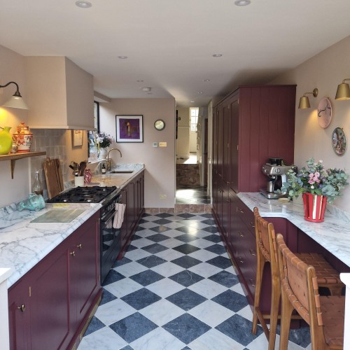
When we first moved in, everything was glossy – the floors, cupboards and even a glittering black granite worktop. Aside from the aesthetics needing TLC, there was a partial partition wall in the middle of the room with a huge range cooker and hood, which cut the room in two and blocked the south-facing light from the window. There were also two questionable girders, which made the ceiling heights different across the room and forced a lower ceiling in the darker part of the room.
A structural survey confirmed that we could remove one of the girders entirely, along with the partition wall. This allowed us to raise the ceiling and really opened up the room.
I designed the new kitchen myself, and began by installing new bi-fold crittall-style doors to maximise the south facing light and open onto our garden patio dining area. The cabinets are Henley by Neptune, and I spent eight months collecting them second hand. They were all sanded back and repainted. I wanted a large kitchen island to connect the spaces, supported by a side run of cabinetry, and re-painted an existing larder cupboard in a bold berry colour, adding some freestanding cupboards and pieces of antique furniture to create a more bespoke feel.
How did you choose the colour palette? Did you have a specific idea in mind or any influences?
I wanted to create a nature-inspired colour palette with some darker colours to add depth and drama. I started by choosing the cabinet colour - Bakehouse Green by Devol - and worked from there, bringing in soft pinks and other warm neutrals to complement it: Bone by Farrow and Ball and Edward Bulmer’s Lilac Pink, along with Spanish White for the ceilings. I added a good dose of antique brass and a beautiful Italian marble worktop, sourced from Imperial Stone and fabricated by the team at Middlesex Marble.
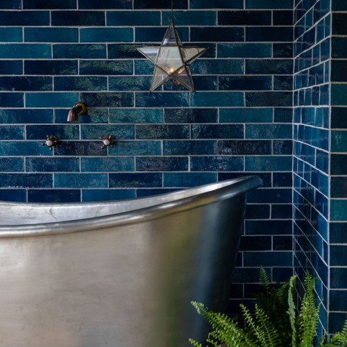
I adore zellige tiles and fell in love with Marlborough’s Isles collection, with its stunning tonal variation. The colour of the Uist tiles harmonises beautifully with the rest of the kitchen and the tiles have a handmade, organic feel that breaks up any uniformity. They have just the depth of colour I was after and the perfect amount of warmth.
How did you come across Marlborough Tiles? Why did you choose them for this project?
I first discovered Marlborough Tiles when you collaborated on a collection with interior designer Emma Sims-Hilditch, who I follow on Instagram. As I learnt more about the brand, I came to know its story, and learnt about how the tiles are made. They really are timeless, made in England and with a depth of colour and quality of glaze that is unmatched. I looked at samples from a lot of different places, but couldn’t find anything of the same standard.
Do you have any tips for our readers who might be embarking on similar projects?
Try not to get caught up on colour straight away. Often my friends will ask me for advice, and they are keen to start with colour. Instead, I suggest that you start with a concept in mind, and create a moodboard based around that vision. Your colours and finishes will flow naturally from there.

Christabel created this moodboard to guide her decision making
On a more practical note, when it comes to planning space and floor layouts, be aware that every piece of trim counts in the measurements, and can add several centimetres to your lineage. Also, know that walls are never straight!
As well as being hands on with the design and renovation of our home, I have been practising my sewing and upholstery, and have made most of my curtains and softs. I will soon be launching an interiors consultancy to help like-minded people who love to take an active role in the renovation of their own homes, but need a boost of confidence. Follow me, @Christabelbx on Instagram, to learn more!
Thanks so much Christabel for sharing the story of your kitchen renovation with us.
We love nothing more than seeing your completed interior design projects. If you would like to see your home featured here, simply tag @MarlboroughTiles in your project photographs on Instagram.
As featured in…


