Inspiration
Tile pattern layouts to inspire your next project
When it comes to good design, we at Marlborough Tiles believe it's all in the detail. And when it comes to wall tiles, there are plenty of details to consider...
It is not only aspects such as the colour, shape, glaze and texture of your tile that will create an impression. While some might take it for granted, the pattern in which you choose to arrange your wall tiles will make a real difference to the look and feel of your space too. Popping the tiles up in the first arrangement that springs to mind can be a real missed opportunity!
We suggest you begin by taking the time to consider the overall look you wish to create for your space. With that established, ask yourself whether your tiles should quietly yet elegantly support the rest of your scheme, or if you would like your tiled area to become a feature and make a statement of its own.
In today's article, we share a variety of looks to inspire and help you choose the perfect layout for your next tiling project.
Brick bond
With its understated elegance and clean lines, the traditional brick bond layout is a truly classic look that is at home in any setting.
Here, tiles are arranged horizontally in rows, with each row staggered against the row below. Rows can be offset by half, quarter or a third of a brick.
The half-brick bond, also known as the 'subway tile' look, or as 'brick pattern' tiling is perhaps the most loved of these looks. Here, the centre of each tile is aligned to the edge of the tile below it.
For a twist on the brick bond layout, consider aligning your brick bond vertically. Also known as the 'stepladder' pattern, this layout will draw the eye up, accentuating the height of your space. Or for something really different, try an offset layout using squares.
Choosing grout that is close in tone to the colour of your tiles will create a harmonious feel, while a selecting a grout that contrasts with your tiles will add drama, drawing attention to their shape and pattern layout.
Herringbone
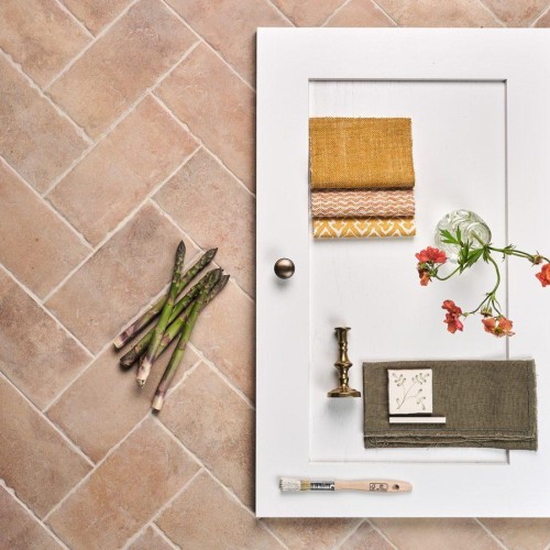
This elegant pattern features brick shaped tiles angled at ninety degrees to one another to create zigzag, chevron, or ‘V’ shaped rows.
Again, arranging the V shapes pointing upwards has the effect of drawing the eye up, accentuating the height of your space. You could also choose to arrange the chevrons to point horizontally which will create the illusion of a wider space.
Alternatively, consider running the bricks perpendicular to the floor to create a staircase effect.
Basket weave
Reminiscent of woven baskets and textiles, this pattern places horizontal and vertical bricks at right angles to one another, lending a modern, geometric appeal to a space.
This layout is particularly lovely when used in a small area such as above a sink or range cooker.
Straight lay
In this classic arrangement, tiles are laid directly on top of each other with their corners aligned to create a grid.
If you're looking to create a subtle backdrop to other design elements, you might choose some beautiful handmade white square tiles with a soft, light coloured grout.
Or for a more dramatic look, pair square tiles in a bold colour such as Manton Hollow from our Savernake collection with a grout in a lighter tone.
Another striking alternative is to stack long bricks or skinny metro tiles (such as those from our Marlborough Matts and Kennet collections) vertically or horizontally, picking out their clean lines with a contrasting grout.
Bringing a sense of harmony to any space, white is a wonderfully versatile choice when it comes to interiors. In this beautiful kitchen, the design team at Neptune has chosen Ivory wall tiles from our Elements collection, finished with white grout.
Ways with scallops
The pretty delicacy of the scallop shape offers an abundance of creative pattern layouts.
Lay yours with the curve uppermost in the pattern in a fan shape for an Art Deco effect, or turn them the other way up to create a ‘fish scale’ pattern. Alternatively, they look just beautiful when arranged in a playful Arabesque pattern, which really emphasises their looping, soft curves.
Hexagons
In our Latitude collection, you’ll discover hexagons in a host of gorgeous blues, greens and greys which coordinate beautifully with wooden flooring. Choose a single shade for a colour block effect, or a mix for a more creative composition.
Don’t feel you have to use hexagons throughout a room - they’re stunning in a small panel or on a feature wall. Thanks to their size, our Latitude hexagon tiles work well with tiles in other shapes - try them alongside bricks to create impact.
We hope this article has provided lots of food for thought and inspiration for your next project, but if you're uncertain about where to start, our design team is on hand to help. Simply get in touch.
As featured in…


