MT in focus
Introducing the new Contemporary Classics
Our signature collection, revisited
In the fast paced world of contemporary interior design, embracing the passing of time becomes an art in itself. Only a few select creations manage to transcend the years.
A quarter of a century ago, the then-new director of Marlborough Tiles, Jamie Robb and product development lead Anita Rivers sat down to begin their first project together. They set themselves an ambitious task: to design a collection of elegant handmade wall tiles that would be the perfect accompaniment to the interior schemes of the time. What they achieved was so much more.

The Contemporary Classics collection quickly became a firm favourite of interior designers, who to this day adore it for its soft palette, clean lines, gently undulating reflective surface and subtle crackle glaze. It’s fair to say that the collection has become something of a design classic.
“A great number of trends have come and gone in interior design in 25 years, but tiles from the Contemporary Classics collection remain some of our most popular and best loved products by those in the know.” says Jamie. “These humble squares and rectangles have graced the walls of some of the most exquisitely designed kitchens and bathrooms in the country.”
Since the collection was created in the 1990s, it’s fair to say that the nation’s aesthetic has evolved, shifting to become softer and more grounded. We tend to choose kitchen cabinetry in gentle neutrals or deep, bold tones, with a harmonious palette, copper and brass fixtures, and natural stone or wood finishes preferred.
So this year, Jamie and Anita agreed that the time had come to revisit the Contemporary Classics collection, refreshing and repositioning it for the present day and into the future.
This is not an overhaul, nor is it a departure from the collection’s origins. The Contemporary Classics collection is made by hand in just the same way as it always was, and features the same gently undulating reflective tile body, the same delicate crackle finish and the same classic sizes. We’ve retained some of the glaze colours and refreshed others, as well as introducing some entirely new hues that are certain to become future favourites. Each of the tones has been carefully considered with today’s design aesthetic in mind, and we’ve no doubt they’ll still remain firm favourites for another quarter of a century and beyond.
“Colour is one of the most fundamental elements of decorating a home,” says Anita. “This revised collection is made up of pared back, nuanced neutrals with beautiful tonal depth, designed to flatter the interiors palettes of today. Looking at them laid out together, the temptation is to think of this as a collection of heritage colours - but these tiles will be as at home in a Georgian kitchen as a contemporary bathroom. They’re soft while maintaining an earthy warmth, and incredibly versatile. You really can’t go wrong here.”

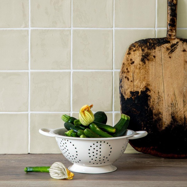
Soft and calming, Contemporary Classics Portland Stone Green square wall tiles, finished with white grout

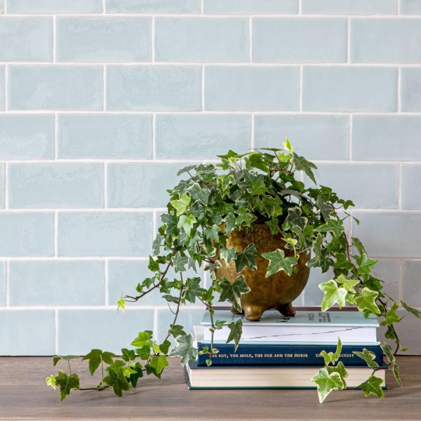
Gentle Contemporary Classics China Blue wall tiles in a small brick shape with white grout
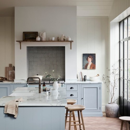
There are several ways in which we are particularly excited to see the refreshed collection used. The first is as part of a tonal scheme - a palette of neutrals in similar tones layered together to create an enveloping ambience. In the notes on the product pages for each of the tiles, you’ll see that we’ve suggested pairings from paint companies such as Farrow & Ball and Little Greene to inspire you.
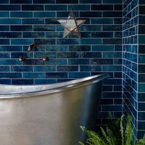
On the other hand, a tonal palette with rich contrast in dark and light will create a charismatic, architectural look. Consider pairing a deep coloured paint, Farrow & Ball’s London Clay perhaps, with a tile in a paler harmonious colour, such as Field Mouse Brown or Moth Grey.
Another approach is to choose accenting colours. That might mean choosing a clean, off-white paint colour to bring out the complexity and depth of a characterful neutral glaze such as Aged Linen Green.
However you decide to use them, as the years pass, you can be assured that our signature collection will always feel like home.
As featured in…


