Your homes
Harmony in the kitchen at The Little Stone Cottage
Emma Diaz and her husband moved into their home, a Georgian cottage in the Cotswolds, eight years ago. They have spent the past six years renovating it themselves: knocking down walls, extending, replastering, decorating, and most recently adding some of our hand painted tiles – from a collection that happens to share her name – to their charming country kitchen.
Emma documents their journey on her popular and simply beautiful Instagram account, @thelittlestonecottage.
In today’s article, we talk to Emma and learn more about her aesthetic, as well as how she puts together colours and design elements to create such a wonderfully harmonious home.

Thanks so much for talking with us today. We just love your aesthetic and have really enjoyed following along as you've been renovating the cottage. How would you describe your design style?
I would describe my style as gentle yet a little wild and colourful, and faithful to the cottage’s heritage and surroundings. I've always been creative, but over the last year or so, I have really learnt to be true to my own style and have grown in confidence. Of course, this means that there are some areas of the cottage that I'd actually like to update now!
Tell us, what was the kitchen like initially?
Well, when we first bought the property it had a tiny galley kitchen that had been added by the previous owner. We knocked it down and built a small extension the width of the house, also knocking through one of the original stone gable end walls to make the kitchen and dining room open plan and much more sociable.
How did you go about designing the overall look for your kitchen?
The tiles were actually a key starting point for changing the aesthetic of the kitchen. We had of course already added our kitchen units in a classic sage green, which I see as quite a neutral colour. I felt it would work with many different pairings, it was just a question of choosing!
I had been following Marlborough Tiles on Instagram for some time and had seen a few different interior designers use their tiles.
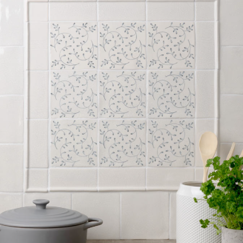
I knew that I wanted to introduce pattern to the kitchen above the cooker, and was torn between Marlborough’s hand piped Ettie tiles and the Emma patterned tiles, so ordered some samples. I still love the Ettie tiles – they’re so tactile and unique – but I felt that the space needed something a little more traditional and ‘country’, so the hand painted, and aptly named 'Emma' tiles won in the end! The pretty sage green pattern mirrors the colour of the units perfectly.

Our design team created a charming panel of hand painted patterned tiles using our Emma Collection.
When it comes to paint, I am always influenced by the time period of our home and the history we have uncovered here. When we were restoring the stone in our living room, we found layers of muted pink and yellow limewashes – these colours were used by the Georgians and work beautifully together. Last year I painted the living room a muted pink, and I chose a lovely warm yellow for the kitchen and dining room – Warm Stone by Edward Bulmer Paint.
The kitchen’s soft yellow and green scheme echoes the colours of our garden with its Cotswold stone walls which really makes the two spaces work together, almost as one.
What were the greatest challenges of the project?
The walls and ceilings are very wonky here, so making sure that everything was level and straight was a real challenge. It’s the reason I’ve avoided having too many shelves up around our home so far!
Do you have any tips for our readers?
When it comes to tiling, preparation and planning is key. Be sure to lay out the tiles first and get everything ready so that it’s all to hand.
And in terms of interior design more broadly, my advice is to go with your gut and choose the colours and pieces that you love – even if they’re a bit different. I worried initially what people would think about the green and yellow pairing, but I simply love it and the way it reflects the nature outside our window.
If you'd like to create a pretty panel like Emma's in your home, our design team is here to help. Simply get in touch.
We love nothing more than seeing your completed interior design projects. If you would like to see your project featured here, simply tag @MarlboroughTiles in your project photographs on Instagram.
As featured in…


